

A club's event signups look solid — maybe even up year over year — but somewhere between RSVP and the door, a chunk of people quietly drop off. Not because the speaker wasn't good or the venue was bad, but because someone decided it wasn't worth the hassle to show up.
That "hassle" is almost always an accessibility gap. And the frustrating part is that most of these gaps are invisible to the people planning the event, because the people they affect usually don't complain. They just stop coming. A member who can't read your registration form with a screen reader doesn't email you. A member with a mobility device who got stranded at a venue with a broken elevator doesn't post about it. They just don't RSVP next time.
So this isn't a "be nice" argument. It's an attendance and retention argument. The point of an event accessibility checklist for clubs isn't to tick compliance boxes — it's to stop losing members you already worked hard to recruit.
What makes accessibility hard for volunteer-run clubs isn't the intention. It's the sequencing. Everyone agrees it matters, but it always lands on the to-do list after the venue's booked, the speakers confirmed, and the emails already drafted. By then, half your options are gone. The approach below is built around when things can realistically get done, sorted into tiers so a stretched volunteer team can knock out the high-impact stuff first.
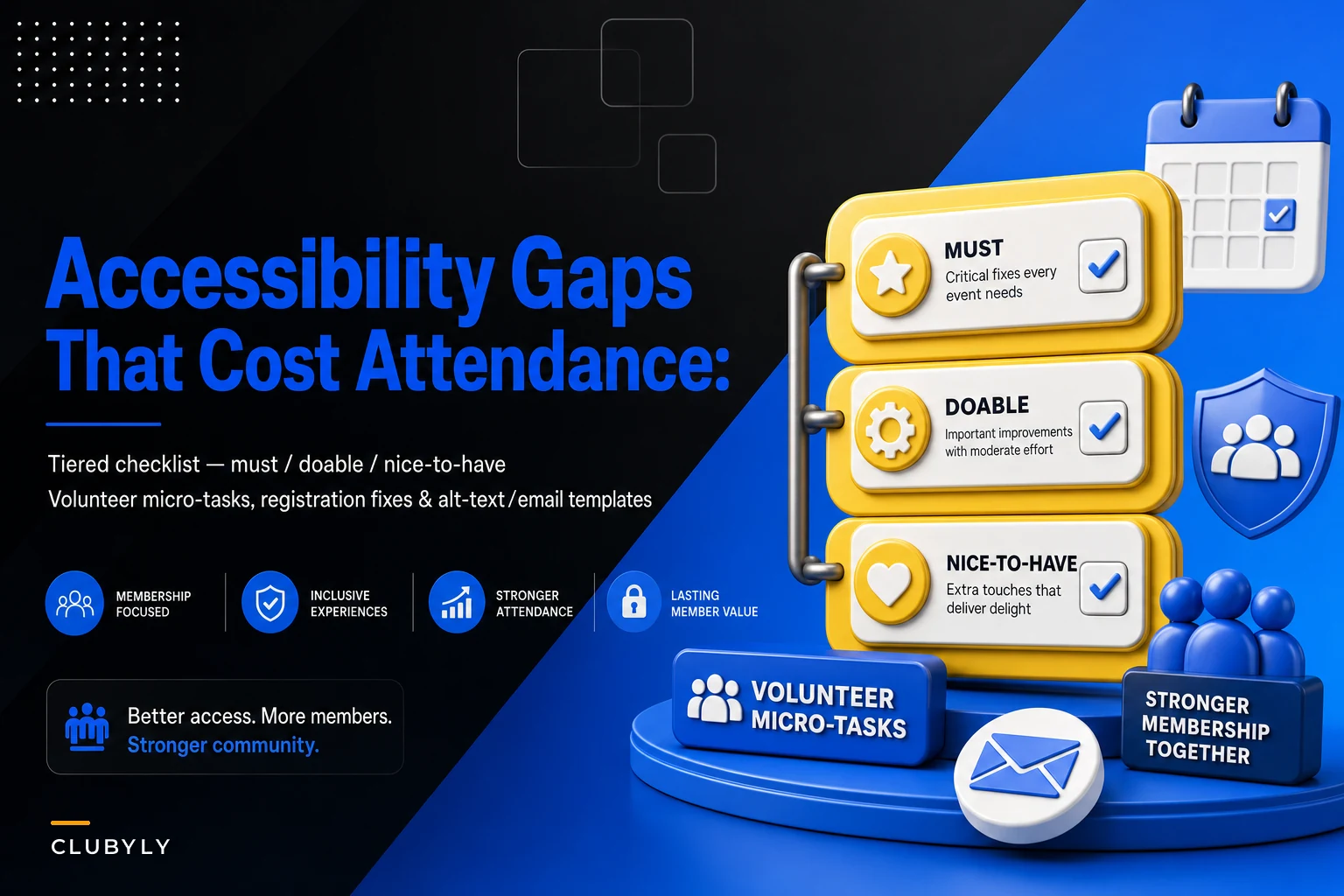
The three-tier model: must, doable, nice-to-have
Most accessibility checklists online are flat — a giant list of 40 things, all presented as equally important. That's how they end up ignored. Nobody with a day job and a Tuesday-night event is doing 40 things.
A tiered approach works better because it matches how volunteer energy actually gets spent. Fix the things that lock people out first, then the things that cause friction, then the polish.
Here's the framework:
| Tier | What it covers | What happens if you skip it | Typical time cost |
|---|---|---|---|
| Must | Barriers that fully exclude someone | A member physically or digitally cannot attend | 10–30 min each |
| Doable | Friction that makes attending harder than it should be | People attend but have a worse experience, or quietly stop coming | 15–45 min each |
| Nice-to-have | Polish that signals you've thought about it | Marginal improvement, but builds reputation over time | Varies |
The mistake clubs make is treating "nice-to-have" items as "must" items because they're more visible or fun to work on. A fancy live-captioning setup feels impressive. But if your registration form can't be completed by someone using voice control, you've spent budget on the wrong tier.
Tier 1 — Must: the barriers that lock people out
These are the non-negotiables. If one of these is broken, someone simply cannot participate, regardless of how motivated they are.
Keep your membership organized and engaged.
Clubyly simplifies member management, event coordination, and payment collection—effortlessly.
- Unified member database
- Automated payment tracking
- Event scheduling & reminders
No credit card required
Registration notices that actually set expectations. Your signup confirmation needs to tell people, before they commit, what they're walking into. A plain line works: "The venue has step-free access via the north entrance. Accessible restrooms are on the ground floor. Need an accommodation? Reply to this email or call [number]." The reason this is Tier 1 is subtle — without it, someone with a specific need has to guess, and most people won't risk showing up to find out. They'll skip it.
Clubs that add a single accommodations line to their registration confirmation often start getting requests they never got before. Those weren't new needs. Those were people who previously assumed the answer was "no" because nobody asked.
Venue step-free access — verified, not assumed. "The venue said it's accessible" is where this goes wrong constantly. A real example: a community space lists itself as wheelchair accessible because there's a ramp at the front — but the ramp leads to a landing, and the actual meeting room is up a half-flight of stairs with no lift. Nobody caught it because the person who booked it walked in through the front and never thought about the second door.
Verify it yourself, in person or with specific photos. Ask three concrete questions: Is there a step-free path from the parking/drop-off to the actual room? Are the accessible restrooms on the same floor as the event? If there's an elevator, when was it last confirmed working?
Form and email readability for assistive tech. This is the digital version of a step at the door. If your registration form is an image, a scanned PDF, or built in a tool that strips out proper field labels, screen-reader users hit a wall. Same with emails that cram everything into one giant image — screen readers read nothing, and the member gets a blank message.
Tier 1 digital basics:
-
Registration form uses real labeled fields, not images of fields
-
Every meaningful image has alt text (more on that below)
-
Emails are actual text, not one big graphic
-
Links say where they go ("Register for the October mixer") not "click here"
-
Color isn't the only way you convey something ("the red date" fails for colorblind members)
Worth noting: a broken first-event experience undoes a lot of the work in your signup-to-active-member activation sequence — a new member who gets locked out of their first event often doesn't come back for a second.
Tier 2 — Doable: friction that quietly drives people away
These won't stop someone cold, but they pile up. Each one is a small "ugh" that makes attending feel like more effort than it's worth.
A proper alt-text and email structure standard. Alt text is the one thing almost everyone does badly, so it's worth getting specific. Good alt text describes function and content, not just "image."
Quick alt-text rules:
-
Describe what matters
"Speaker Dana Reyes presenting at a podium" not "photo" or "IMG_4821"
-
If an image is purely decorative, give it empty alt text so screen readers skip it — don't describe your background flourish
-
Don't start with "image of" — the screen reader already announces it's an image
-
For event flyers saved as images, put the actual event details (date, time, place) in the email body as text too. The flyer is optional; the text is the real information
Email structure matters just as much. Use real headings so screen-reader users can jump between sections, keep a logical reading order, and put the most important thing — date, time, location, accommodation contact — near the top in plain text.
Seating and sightline planning. If you've got a speaker or a screen, reserve a couple of seats near the front for members who need to lip-read, see clearly, or sit close for any reason — and actually keep them reserved. The common failure is reserving them, then watching early arrivals fill them by 6:45.
Quiet arrival and clear signage. A surprising amount of friction is just people not knowing where to go. Clear signs from the entrance to the room, from the room to the restrooms, help neurodivergent members and honestly everyone else too. If your event has a loud, chaotic check-in situation, consider a calmer alternate check-in point.
Captioning for anything with audio. Full live captioning is great but can be Tier 3 depending on budget. The doable version: if you record talks, add captions after. If you run hybrid sessions, most video platforms now have auto-captions you can turn on in two clicks — not perfect, but far better than nothing.
Tier 3 — Nice-to-have: the polish that builds reputation
These are the items that signal to members you've genuinely thought about inclusion. Worth doing once the first two tiers are reliable — not before.
-
Professional live captioning or a sign-language interpreter for larger events
-
A sensory-friendly quiet room for longer events or conferences
-
Dietary and ingredient labeling on all food, not just "vegetarian option available"
-
Large-print versions of any printed materials
-
An accessibility page on your website that documents your standard practices, so members know what to expect every time
The thing about Tier 3 items: they're what members talk about. Someone who used your quiet room will mention it to a friend. But they only count if the foundation is solid. A club with a polished accessibility page and a registration form no screen reader can navigate looks worse, not better — now the gap feels intentional.
Quick volunteer tasks: accessibility in 10-minute chunks
The real unlock for volunteer-run clubs is breaking this into tasks small enough that one person can finish in a single sitting. Nobody's going to "do accessibility." But someone will spend ten minutes writing alt text for next week's email.
Here's a task list you can literally assign:
-
Walk the venue route (20 min). Park where members park, walk to the actual room, test the restroom path. Note every step, narrow door, or broken thing. Take photos.
-
Write the registration accommodations line (10 min). One sentence plus a contact method. Reuse it every event.
-
Alt-text pass on the next email (10 min). Go image by image. Decorative ones get empty alt text; meaningful ones get a real description.
-
De-image the email (15 min). Pull date/time/location out of any flyer image and type them as text in the body.
-
Reserve-and-hold seating (ongoing, 0 min). Assign one greeter to protect the reserved seats until 5 minutes past start.
-
Signage check (15 min). Print or confirm signs from entrance → room → restrooms.
-
Caption the last recording (20 min). Turn on the platform's caption tool or clean up auto-captions.
These are micro-tasks with a clear "done" state — that's what makes them get picked up. A vague "improve accessibility" assignment sits untouched; "write the accommodations line, here's the template" gets done before the next meeting.
Start by assigning one of these short tasks to a specific volunteer with a deadline — it's much more likely to happen.
The workflow below visualizes how a volunteer can pick a single quick task and complete it during a short sitting.
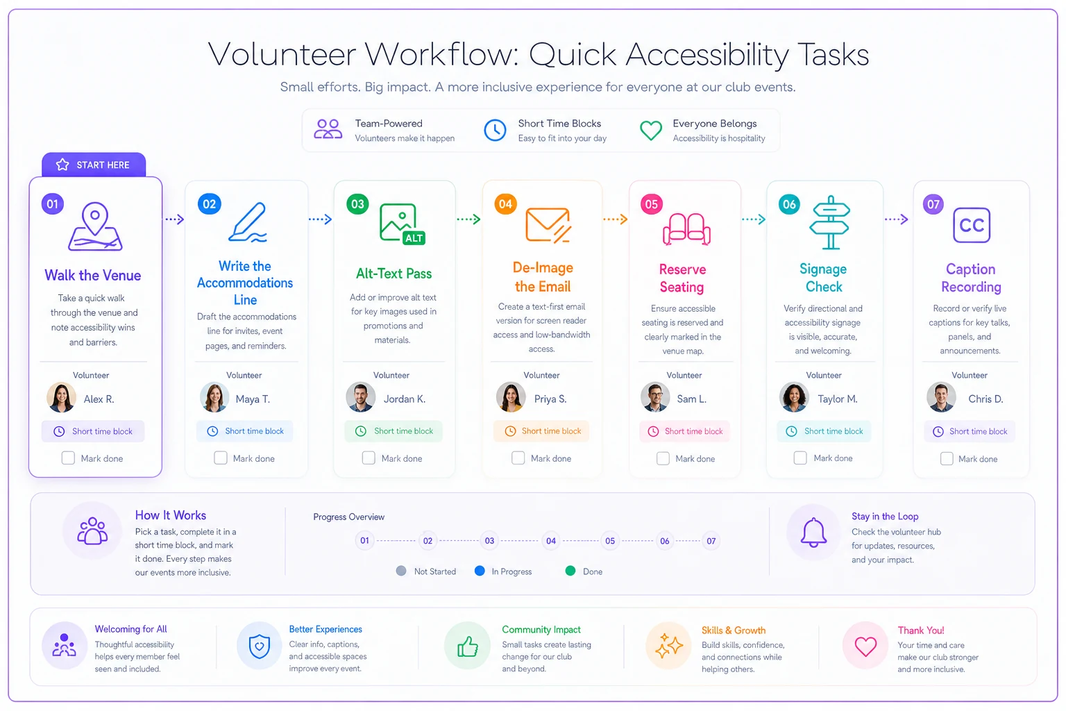
These small wins stack up — one completed task per week makes accessibility a normal part of event prep, not an afterthought.
A real scenario
A regional hobbyist club — somewhere around 180 active members, monthly evening events — kept seeing RSVPs in the 40s but actual turnout closer to the high 20s. They assumed it was normal flakiness and over-invited to compensate.
Two things surfaced when they actually asked around. First, their registration confirmation was a single image-based flyer, so members using screen readers were getting what amounted to blank emails and signing up by guessing from the subject line. Second, their usual venue had a side entrance everyone used that happened to have two steps — the step-free main entrance was locked after 6 pm, which nobody on the organizing team knew.
The fixes were almost embarrassingly small. They moved event details into plain text in the email, added an accommodations line, and arranged with the venue to keep the accessible entrance unlocked and signposted. No real budget — a couple of volunteer hours.
Over the following months, the RSVP-to-attendance gap narrowed noticeably. A couple of long-lapsed members came back. Nobody sent a thank-you note about accessibility — they just showed up, which is the whole point. The club's own estimate was that they'd been quietly losing somewhere around 5–8 attendees per event to problems they could've fixed in an afternoon.
When to skip the fancy stuff
Not every item is worth it for every club.
When live captioning and interpreters make sense: larger events, conferences, anything you're recording and distributing, or when a member has specifically requested it. For a 20-person monthly meetup, professional captioning is usually over-investment — auto-captions plus accommodation-on-request covers it.
When an accessibility page is premature: if your registration flow and venue basics aren't solid yet, don't publish a polished page describing standards you don't actually meet. Fix the foundation, then document it.
Who's over-investing: clubs that buy impressive Tier 3 gear while Tier 1 is still broken. Groups that rent captioning displays for a venue whose only restroom is up a flight of stairs. That's effort pointed at the wrong tier entirely. Start where people get locked out, not where you get noticed.
Pulling it together
Accessibility gaps don't usually show up as complaints. They show up as attendance that's a little lower than it should be, the same faces every month, and new members who come once and vanish. The tiered checklist works because it matches reality: fix the hard barriers first, reduce friction second, add polish last — and break all of it into tasks small enough that a volunteer can actually finish them.
If you're already thinking about the on-the-ground logistics of events, this pairs naturally with your event safety runbook and onsite roles — the greeter protecting reserved seats and the volunteer checking the step-free route are the same kind of small, assigned responsibility that keeps an event running for everyone.
Start with one Tier 1 item this week. The venue walk or the registration line. Then let it become part of how your club runs events by default, instead of something you remember too late.
Accessibility gaps don't usually show up as complaints. They show up as attendance that's a little lower than it should be, the same faces every month, and new members who come once and vanish. The tiered checklist works because it matches reality: fix the hard barriers first, reduce friction second, add polish last — and break all of it into tasks small enough that a volunteer can actually finish them.
Start with one Tier 1 item this week. The venue walk or the registration line. Then let it become part of how your club runs events by default, instead of something you remember too late.
Ready to streamline your club operations?
Join 500+ clubs using Clubyly to save time, boost member engagement, and grow their communities.