


Every quarter, the same pattern plays out across membership organizations. A board member asks for "better visibility into operations." The executive director scrambles to pull together forty slides of data. Nobody reads past slide seven. Critical decisions get delayed another quarter. Meanwhile, the actual problems—membership churn climbing from 18% to 24%, program attendance dropping below break-even thresholds—stay buried in disconnected spreadsheets.
Most clubs already track the right information. They just haven't built a reporting architecture that connects operational realities to strategic decisions. The difference between clubs that thrive and those that struggle isn't how many metrics they track—it's how they organize, present, and hand off those metrics.
The operational-strategic divide that breaks reporting
Small clubs typically generate two completely disconnected types of reports. Staff creates detailed operational spreadsheets tracking daily activities—event attendance, volunteer hours, payment processing times. Meanwhile, someone else (usually scrambling the night before the board meeting) cobbles together strategic presentations about growth trajectories and financial sustainability.
This split creates a fundamental problem: operational metrics that signal upcoming strategic issues never reach decision-makers in time.
Take a rowing club. Their operations manager meticulously tracked equipment usage rates, showing that Tuesday morning sessions averaged only three participants despite requiring two coaches. That metric—buried in a weekly staff spreadsheet—represented roughly $1,800 monthly in unnecessary coaching costs. Because their board reports only showed aggregate program revenues and membership totals, this inefficiency ran for eleven months before anyone with budget authority noticed.
The solution isn't adding more metrics to board presentations. It's building a taxonomy that explicitly connects operational indicators to strategic outcomes, then establishing clear escalation triggers.
Building your metric taxonomy (without the MBA buzzwords)
Most clubs organize metrics by department—membership metrics, program metrics, financial metrics. This creates silos where related indicators get separated. A better approach organizes metrics by decision scope and timing.
Keep your membership organized and engaged.
Clubyly simplifies member management, event coordination, and payment collection—effortlessly.
- Unified member database
- Automated payment tracking
- Event scheduling & reminders
No credit card required
Here's the taxonomy structure that actually works for small-staff organizations:
Pulse Metrics (Weekly Operational)
These tell you if basic operations are functioning. Track them weekly, but only escalate when they cross specific thresholds.
-
New member signups vs. target pace
-
Event registrations vs. minimum viable attendance
-
Volunteer shift fill rates
-
Payment failure rates
-
Member service response times
Health Metrics (Monthly Tactical)
These indicate whether your systems and processes are sustainable. Review monthly with management, escalate quarterly to board if trending wrong.
-
Member engagement scores (login frequency, event participation)
-
Volunteer burnout indicators (consecutive shifts, last-minute cancellations)
-
Program efficiency ratios (revenue per participant hour)
-
Operational cost per active member
-
System usage rates (member portal adoption, automated payment enrollment)
Strategic Metrics (Quarterly Directional)
These drive resource allocation and strategic decisions. Always include in board reporting with context and recommendations.
-
Member lifetime value trends
-
Churn rate by segment and reason
-
Program portfolio performance (which programs subsidize others)
-
Capital reserve adequacy
-
Market position indicators (membership growth vs. comparable organizations)
The critical piece most organizations miss: you need explicit translation rules between these levels. When does an operational issue become a strategic concern? Without clear thresholds, everything becomes "urgent" and nothing gets proper attention.
The cadence problem nobody talks about
Boards meet quarterly, so organizations create quarterly reports. Staff meetings happen weekly, so they get weekly updates. This seems logical until you realize problems don't follow meeting schedules.
A youth soccer club learned this the hard way. Their spring season registrations opened in February, but the board didn't meet until late March. By the time the board saw that registrations were 40% below projections, it was too late to adjust field rentals or coaching contracts. They absorbed around $12,000 in unnecessary costs.
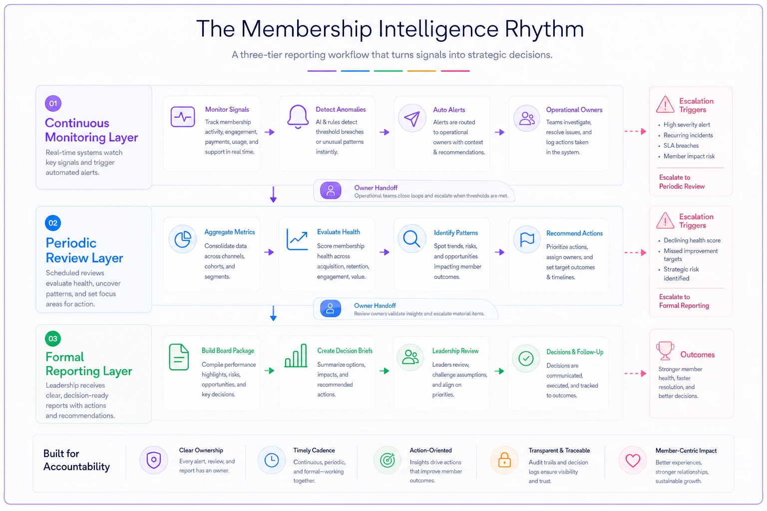
The fix requires breaking the link between reporting cadence and meeting cadence. Build a three-tier reporting rhythm:
Continuous Monitoring Layer
Set up automated alerts for critical thresholds. When new member signups drop below 80% of target pace for two consecutive weeks, that triggers an immediate email to the executive director. When volunteer no-show rates exceed 15% in a month, the volunteer coordinator gets notified. This isn't about creating more reports—it's about catching problems before they compound.
Periodic Review Layer
Even without formal meetings, certain metrics need regular human evaluation. Every two weeks, someone should be scanning the health metrics dashboard for patterns. Are multiple indicators trending negative at once? Is one program consistently underperforming? This step prevents the "surprise crisis" that somehow nobody saw coming despite all the data being there.
Formal Reporting Layer
Board packages, committee updates, and strategic reviews follow your governance calendar. But now they're drawing from continuously updated data rather than scrambling to create point-in-time snapshots.
Visualizing the three-tier reporting rhythm can help align triggers, owners, and notifications.
This step prevents the "surprise crisis" that somehow nobody saw coming despite all the data being there.
Visual templates that boards actually understand
Clubs sometimes build gorgeous dashboards that nobody uses because they're too complex to interpret quickly. The best visual templates follow three principles: immediate clarity, consistent structure, and actionable insight.
Start with a "traffic light summary"—a single page showing every strategic metric as green (on track), yellow (needs attention), or red (requires immediate action). Don't make people hunt for problems. A community theater group implemented this after board members complained about data overload, and meeting discussions became noticeably more focused on actual decisions rather than trying to decode what the numbers meant.
For operational metrics, use spark lines showing 13-week trends rather than point-in-time numbers. This helps differentiate normal variation from actual trends. Include target zones as shaded areas so deviation is immediately visible.
A template structure that works:
-
Page 1
Strategic Scorecard
- Overall health indicator (single composite score) - Five key strategic metrics with traffic light status - Three-month trend arrows - One sentence describing the most important insight -
Page 2-3
Operational Performance
- Metric taxonomy table showing pulse→health→strategic connections - Spark line trends for each operational area - Threshold breach notifications - Required actions or decisions -
Page 4
Recommendations and Requests
- Specific decisions needed from board - Resource requests with justification tied to metrics - Risk factors to monitor next period
Keep the main report under five pages. Supporting data goes in appendices for board members who want to dig deeper—but don't force everyone through twenty pages to find the three decisions that actually need to be made.
Clear owner handoffs (the missing link in most systems)
Even a well-designed metric system falls apart without clear ownership and handoff protocols. Too many clubs have orphan metrics—numbers that get tracked but nobody owns, or metrics that multiple people think they own, which leads to conflicting reports.
Map every metric to a single operational owner and a single strategic stakeholder. The operational owner ensures data accuracy and monitors thresholds. The strategic stakeholder interprets implications and makes recommendations.
Metric: Member retention rate
-
Operational Owner
Membership Coordinator (tracks monthly, investigates drops)
-
Strategic Stakeholder
Board Membership Committee Chair (quarterly review, policy recommendations)
-
Handoff Protocol
When retention drops below 85% for two consecutive months, membership coordinator schedules a meeting with committee chair within five days
What makes handoffs actually work is that escalation triggers need to be specific. Not "when retention seems problematic" but "when retention drops below 85% for two consecutive months." That removes the guesswork—and the political dynamics—from escalation decisions.
Document your handoff rules in a simple matrix:
| Metric | Operational Owner | Strategic Stakeholder | Yellow Trigger | Red Trigger | Escalation Action |
|---|---|---|---|---|---|
| New member velocity | Membership Manager | Board President | <90% of target for 2 weeks | <75% of target for 1 week | Email alert + called meeting |
| Event attendance rate | Program Director | Program Committee | <70% capacity average | Single event <50% capacity | Review program viability |
| Volunteer fill rate | Volunteer Coordinator | Operations VP | <85% for month | <80% for 2 weeks | Activate backup recruitment |
The handoff protocol should also specify what information gets passed along. Raw data dumps don't help strategic stakeholders make decisions. The operational owner should provide the metric trend, likely causes for the variance, corrections already attempted, and recommended next steps.
Make escalation triggers measurable and timebound to avoid ambiguity.
The handoff protocol should also specify what information gets passed along. Raw data dumps don't help strategic stakeholders make decisions. The operational owner should provide the metric trend, likely causes for the variance, corrections already attempted, and recommended next steps.
When good metrics reveal uncomfortable truths
Sometimes the biggest challenge isn't building the reporting architecture—it's dealing with what it surfaces. A professional association discovered through their new reporting system that their flagship annual conference, which consumed 30% of staff time, actually lost money once overhead costs were properly allocated. Board members who had championed that conference for years suddenly faced data showing it needed restructuring or elimination.
This is where linking operational metrics to strategic decisions becomes genuinely difficult. The reporting architecture must connect metrics to mission impact, not just financial performance. That conference might lose money but drive 60% of new member acquisitions. Your reporting needs to surface those connections.
Build "context notes" into your templates. When a metric shows poor performance, require the operational owner to provide context: Is this temporary or structural? What external factors are contributing? What's the cost of fixing versus accepting? Without that layer, you end up with boards making decisions based on incomplete pictures.
Automation without losing the human touch
Modern clubs need reporting systems that largely run themselves. Manual data gathering and report generation burns staff time and introduces errors—but full automation can miss important nuances that only humans notice.
The sweet spot is automating data collection and basic report generation while keeping human interpretation and context in the loop. An environmental club automated their member engagement tracking, pulling data from their event system, email platform, and member portal to automatically generate the monthly dashboard. But the membership manager still spent about 30 minutes adding context—explaining why engagement dropped in August (wildfire smoke canceled outdoor events) and what they were doing about it.
AI-powered operational software can genuinely change how small clubs handle board reporting. Instead of staff spending days assembling reports, these platforms can continuously monitor your key engagement metrics, automatically flag anomalies, and generate first drafts of reports. The membership manager then reviews, adds context, and makes sure the board gets actionable insights rather than raw data.
One youth sports organization cut report preparation from around 12 hours monthly to 90 minutes by implementing an AI-assisted platform that pulled data from their registration system, payment processor, and communication tools. The system also surfaced patterns human reviewers might miss—like a correlation between volunteer shift timing and no-show rates—while staff focused on interpreting what those patterns actually meant for operations.
The compact reporting playbook
Here's a streamlined implementation approach that works for small-staff membership organizations:
-
Week 1-2
Audit and Classify
— List every metric currently tracked anywhere in your organization. Classify each as pulse, health, or strategic. Identify orphan metrics and redundant versions of the same thing. Expect to eliminate 30–40% of metrics that don't actually drive decisions. -
Week 3-4
Design Information Flow
— Map operational owners and strategic stakeholders. Define specific escalation triggers for each metric. Create handoff protocols with templates for context notes. Build the three-tier monitoring rhythm. -
Week 5-6
Build Templates and Tools
— Design your 5-page board template. Set up automated data collection where possible. Create a dashboard for continuous monitoring. Test with historical data to validate thresholds. -
Week 7-8
Train and Launch
— Train operational owners on their metrics and thresholds. Run parallel reporting for one cycle to work out issues. Adjust triggers based on initial results. Document everything in a simple operations guide.
This timeline assumes you already have basic data systems in place. Starting from spreadsheet chaos adds another two to three weeks upfront for data cleanup and system selection.
The clubs that move through this process fastest are usually the ones who resist the urge to make it perfect before launching. Get the basics running, then refine.
Real numbers from a real implementation
A regional hiking club with 850 members and 3.5 full-time equivalent staff implemented this reporting architecture last spring. Before the change, their board packages averaged 47 pages, took the executive director two full days to prepare, and generated lengthy discussions without clear outcomes.
-
Board packages
5 pages primary, 12 pages appendix
-
Preparation time
3 hours monthly
-
Board meeting time on reports
decreased from 45 to 15 minutes
-
Strategic decisions made per meeting
increased from 1-2 to 3-4
-
Critical issues caught before escalation
7 (saving an estimated $15,000 in prevented problems)
More importantly, the board stopped asking for "more data" and started asking "what should we do about this?" The conversation shifted from understanding what happened to deciding what happens next.
When this architecture doesn't work
This approach fails in three predictable situations.
First, when organizations have no reliable data systems. If your membership list lives in one volunteer's personal spreadsheet and financial data requires manual calculation from bank statements, fix those fundamentals first. You can't build reporting architecture on quicksand.
Second, when there's no governance discipline. If your board routinely ignores reports, makes decisions based on anecdotes, or constantly changes strategic direction, better reporting won't fix that. The architecture assumes people will actually use the information.
Third, when the organization is too small or too simple. A 50-member social club that meets monthly doesn't need a three-tier reporting architecture. They need a simple spreadsheet and regular conversations. Don't over-engineer solutions for problems you don't have.
The path forward
Effective board reporting for membership organizations isn't about perfect data or complex analytics. It's about creating clear connections between daily operations and strategic decisions, establishing rhythms that catch problems early, and making sure the right information reaches the right people at the right time.
Start small. Pick five metrics that truly matter to your organization's success. Build the taxonomy, establish owners, and create simple templates. Run this lighter system for one quarter, then gradually add complexity as you prove the value and work out the kinks.
The clubs that thrive over the next decade won't necessarily be the ones with the most data or the best dashboards. They'll be the ones that built reporting architectures connecting operational reality to strategic decision-making—enabling small staffs to serve their members effectively while maintaining real governance oversight. Your board doesn't need more reports. They need better architecture that transforms operational noise into strategic signal, and once you build that, the conversation changes pretty quickly.
Your board doesn't need more reports. They need better architecture that transforms operational noise into strategic signal, and once you build that, the conversation changes pretty quickly.
Ready to streamline your club operations?
Join 500+ clubs using Clubyly to save time, boost member engagement, and grow their communities.