


Most clubs don't have a data problem. They have a maintenance problem. Someone builds a lovely dashboard in a burst of energy, it runs beautifully for two months, then the person who built it steps down, the spreadsheet formula breaks quietly, and six months later nobody trusts the numbers enough to make a decision with them. The board asks "how are we doing on retention?" and the honest answer is "we're not really sure anymore."
That's the gap this article is about. Not which metrics to track — that's been covered plenty. The question is: what's the smallest possible operating system that keeps measurement alive when your entire "analytics team" is three volunteers who each give you four hours a week?
Measurement in small clubs fails for a boring reason. Not because the metrics are wrong. Because nobody owns them, nobody checks whether the underlying data is garbage, and every good idea for an experiment gets lost in a Slack thread. The numbers rot. And once numbers rot, learning stops.
Why measurement quietly dies in most clubs
A club goes through a burst of enthusiasm — usually after a good workshop or a frustrated board meeting — and builds real infrastructure. Dashboards, a survey, a retention tracker. For a while it's genuinely good.
-
The single-point-of-failure builder. One person understands the whole system. When they burn out or roll off, the knowledge leaves with them.
-
Silent data drift. Someone changes a form field, renames a column, or starts entering dates in a different format. Nothing breaks visibly. The dashboard just slowly starts lying.
-
The idea graveyard. People do have good ideas for experiments — "what if we changed the welcome email timing?" — but there's no place for those ideas to go, so they evaporate.
-
Reporting theater. The board gets a slide deck full of numbers that nobody uses to decide anything. Measurement becomes a ritual, not a tool.
The common thread: measurement is being treated as a project when it needs to be treated as a routine. Projects end. Routines survive people leaving. A measurement operating system for clubs is really just the minimum set of roles, checks, and rhythms that turns a project into a routine.
"Minimum" is the operative word here. If your system requires more than a few hours a week to keep running, it will not survive a busy season. It'll be the first thing dropped when the annual gala eats everyone's time.
The three roles that actually hold it together
You don't need an org chart. You need three named humans who own three distinct things. The trick is that these are narrow roles — each one is small enough that a volunteer can hold it without it swallowing their life.
Keep your membership organized and engaged.
Clubyly simplifies member management, event coordination, and payment collection—effortlessly.
- Unified member database
- Automated payment tracking
- Event scheduling & reminders
No credit card required
The Data Steward owns whether the numbers are true. Not what they mean — whether they're clean. This person makes sure the member export still has the fields it's supposed to, that dues status isn't half-blank, that the same person isn't in the system twice. They run the audits (more on those below). They're the one who says "hold on, this retention number looks weird" before it hits a board slide.
The Dashboard Owner owns whether the numbers are visible and readable. They maintain the actual views, fix broken formulas, and — critically — decide what gets removed when the dashboard gets cluttered. A good dashboard owner deletes more than they add. They're the guardian against the slow creep of forty metrics nobody looks at.
The Experiment Owner owns whether the club is learning. They run the intake funnel for test ideas, prioritize them, and make sure that when an experiment finishes, someone actually writes down what happened. This is the role clubs skip most often, and it's why so many clubs measure endlessly but never change anything.
| Role | Owns | Weekly time | What breaks if it's empty |
|---|---|---|---|
| Data Steward | Data accuracy & audits | ~1–2 hrs | Numbers slowly become wrong; nobody notices |
| Dashboard Owner | Visibility & readability | ~1 hr | Dashboard rots into clutter; board stops looking |
| Experiment Owner | Learning & tests | ~2–3 hrs | Ideas evaporate; club measures but never improves |
The table above isn't aspirational — it's the floor. Below this, you're running on luck.
One important note on scale: in a tiny club, one person might wear two of these hats. That's fine. What's not fine is having zero people in a role, or having "everyone" own it — which is the same as no one. Once the club grows past a couple hundred members, split them apart. The data steward job especially gets heavier fast as more integrations and data entry points appear.
Minimal data-quality checks (the part everyone skips)
Data quality sounds like a big-company concern. It isn't. The most common reason a small club's dashboard is wrong is embarrassingly mundane: sloppy manual entry, a form field that changed, or a CSV import that doubled some records.
You don't need a data governance framework. You need a short, repeatable check that the data steward runs on a fixed rhythm. Something like this, done monthly, takes about twenty minutes:
-
Row count sanity check. Did total members jump or drop by an amount that doesn't match reality? A membership base that "grew" by 80 overnight usually means a duplicate import.
-
Blank-field scan. Pick your 4–5 critical fields (join date, dues status, email, membership tier). What percentage are blank? If "dues status" is 30% empty, your revenue reporting is fiction.
-
Duplicate check. Same email or same name appearing twice. Duplicates quietly inflate every count you have.
-
Date format check. The silent killer. If half your join dates are MM/DD and half are DD/MM, every cohort analysis is broken and you won't see it in the summary numbers.
-
Spot-check five random records against reality. Do they look right? This catches things automated checks miss.
Write down the result each month — even just "checked, all clean" in a log. That log is worth more than it looks. When a number seems off three months from now, you can see exactly when the drift started.
If a field starts drifting, check the most recent change log first.
Clubs that catch data problems early aren't the ones with fancier tools. They're the ones where checking is somebody's actual job on a schedule, instead of something that happens only when a number looks obviously wrong. By the time a number looks insane, you've already made a few bad decisions on it.
If you're still running everything through hand-maintained spreadsheets and it's starting to feel fragile — that fragility is the signal. It's the point where a lot of clubs start looking at proper membership tooling. But don't jump there yet. Get the routine working first; the tool is worthless without it.
A lightweight experiment intake funnel
This is where clubs leave the most value on the table. People have ideas constantly. "We should try a different meeting time." "What if new members got a call in week one?" Those ideas are gold, and almost all of them die in casual conversation.
The fix is simple: give ideas a front door. One form, four questions.
-
What do you want to test?
-
What do you expect to happen?
-
How will we know if it worked? (one metric)
-
How much effort is this — small, medium, or large?
That's the intake. Now the experiment owner has a backlog instead of a memory. Once a month, they prioritize it. You don't need a complicated scoring model. A rough impact-vs-effort read handles most of it: high impact, low effort goes first. Big expensive experiments wait until you've banked some easy wins.
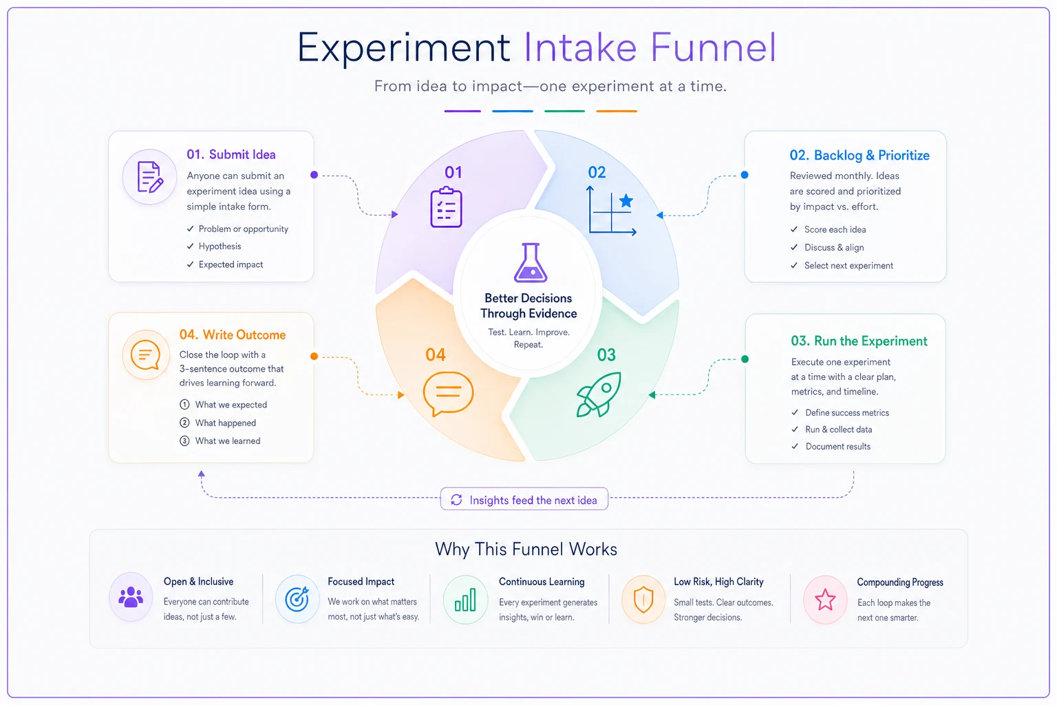
The prioritization funnel in practice:
-
Collect — ideas land in the intake form all month.
-
Screen — kill anything you can't actually measure. If there's no clear "how will we know," it's not an experiment, it's a hope.
-
Rank — sort by impact and effort. Pick one, maybe two, per cycle. A small club running one clean experiment a month is doing better than most.
-
Run — with a defined start, end, and the single metric you agreed to watch.
-
Write it down — three sentences. What we tried, what happened, what we'll do next. This is the step that turns activity into learning.
That last step is the whole game. Clubs that skip the write-up run the same experiment twice, two years apart, because nobody remembered it didn't work the first time. Also worth watching: running too many tests at once. If you change the email timing and the meeting format and the welcome sequence in the same month, you'll have no idea which one moved the number. One variable at a time. Sample-size discipline matters more than volume, especially with the tiny datasets most clubs are working with.
Here's a simple workflow view of the intake funnel.
One variable at a time. Sample-size discipline matters more than volume, especially with the tiny datasets most clubs are working with.
The reporting cadence that keeps the board useful
Board reporting fails in one of two directions. Either the board gets a firehose — forty metrics, no story — or they get nothing until something's on fire. Both make the board reactive.
| Cadence | Audience | Contents |
|---|---|---|
| Weekly (internal) | Ops volunteers | Data quality flags, running experiments |
| Monthly | Core team / committee | Key KPIs vs thresholds, experiment results |
| Quarterly | Full board | Trends, retention/cohort view, big decisions |
| Annually | Membership | Highlights, transparency, what changed |
The monthly report is the workhorse. It should fit on one page and answer one question per metric: are we above or below the line we agreed on? Not "here's the number" — "here's the number, here's the threshold, here's whether we're okay." A metric without a threshold is just trivia. If you haven't set those lines yet, the work of choosing which engagement metrics actually matter and where the thresholds sit is what makes the whole reporting layer function.
For the quarterly board view, resist the urge to add more metrics. Add depth instead. This is where a proper reporting architecture with clear owner handoffs earns its keep — the board should see trends and cohorts, not a bigger pile of the same monthly numbers. The retention picture belongs here specifically, because cohort movement is slow; looking at it weekly just creates noise. If you're working with small numbers, the discipline around cohort retention on tiny datasets keeps you from over-reading a swing that's really just two people.
One pattern worth flagging: the handoff between whoever prepares the report and whoever presents it. In a volunteer club, those are usually different people — and things get dropped. The presenter doesn't understand a number and either skips it or guesses. A five-minute handoff conversation beforehand sounds trivial. It prevents the board from making decisions on numbers the presenter didn't actually understand.
Tiny-team spreadsheet patterns that survive turnover
Most clubs live in spreadsheets, and that's genuinely fine at small scale — as long as the spreadsheets are built to survive the person who made them leaving. That's the design constraint everything else follows from.
A few patterns that hold up:
-
Separate raw data from calculations. Keep one tab that's only the imported or entered raw data, untouched by formulas. All your analysis references that tab. When something breaks, you know the raw layer is clean.
-
A "definitions" tab. One page that says what every metric means and how it's calculated. When the dashboard owner leaves, the next person reads this instead of reverse-engineering formulas.
-
Named ranges over cell references.
=SUM(dues_paid)survives a reorganization.=SUM(D2:D340)does not. -
A change log. One tab, four columns
date, who, what changed, why. Two minutes per change. Saves hours of "why is this number different than last month?"
-
Freeze the past. At the end of each quarter, copy the numbers into a static snapshot. Live formulas will retroactively change your history when you fix something upstream, and then your old board reports won't match your spreadsheet. Snapshots keep the record honest.
A spreadsheet built by one person for themselves is a liability. A spreadsheet built to be handed off is an asset. Same file, completely different survival odds.
A real scenario
A regional hobbyist association — roughly 380 members, entirely volunteer-run — had the classic setup. Good dashboard, built by their treasurer. Then the treasurer stepped down. Within about four months the retention number on the board deck was flatly wrong: it showed retention climbing while actual renewals were sliding, because a dues-status field had stopped syncing and nobody was checking.
They didn't buy anything new. They assigned the three roles, started a twenty-minute monthly data check, and put a four-question intake form in front of the board. The first real audit turned up around 40 duplicate records and a chunk of blank dues fields — enough to have been quietly overstating "active" members by close to 10%.
Six months later the picture was different. Not because the numbers got better — because the numbers got true. They caught a renewal dip early instead of a quarter late, ran two small welcome-sequence experiments (one worked, one didn't, both got written down), and the board stopped debating whether to trust the deck. That last part is the real win. A board that trusts its numbers argues about decisions. A board that doesn't argues about the numbers themselves, forever.
When this is worth it — and when it isn't
This system makes sense once you're past about 150–200 members, or once more than one person is touching member data, or once the board is making real money and program decisions off your numbers. Below that, a single well-kept spreadsheet and one careful person is enough. Don't build machinery you don't need.
Rolling all of this out at once is a mistake. Clubs that try to launch three roles, five audits, an intake funnel, and a four-tier reporting cadence in one month abandon the whole thing by month two. Start with the data steward and the monthly check. That single habit fixes more than everything else combined. Add the experiment funnel once the numbers are trustworthy. Add the full reporting cadence last.
And if the real problem is that you haven't decided what to measure yet, no operating system will save you — you'll just maintain the wrong numbers very reliably. The membership survey program work of sorting out the what comes first. This article is about the how it survives.
The point of all of it
A measurement operating system for clubs isn't about sophistication. It's about survival — building measurement infrastructure that outlives the volunteer who set it up. Three named owners, a short monthly check, a front door for ideas, a reporting rhythm the board actually uses, and spreadsheets designed to be handed off.
None of it is fancy. All of it is boring on purpose, because boring is what survives a busy season and a leadership transition. The clubs that keep learning year after year aren't smarter or better resourced. They just made measurement a routine instead of a hero project. When the numbers stay true and someone owns the learning loop, the club stops guessing and starts improving on purpose — and that compounds quietly, long after the person who set it up has moved on.
None of it is fancy. All of it is boring on purpose, because boring is what survives a busy season and a leadership transition. The clubs that keep learning year after year aren't smarter or better resourced. They just made measurement a routine instead of a hero project. When the numbers stay true and someone owns the learning loop, the club stops guessing and starts improving on purpose — and that compounds quietly, long after the person who set it up has moved on.
Ready to streamline your club operations?
Join 500+ clubs using Clubyly to save time, boost member engagement, and grow their communities.